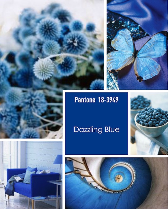
I’ve gotten two clothing catalogs that are telling me that blue is the hot color for spring. I read that Dazzling Blue (which bears a great resemblance to Facebook blue) is Pantone’s Color of the Year 2014.
Talbott’s is showcasing “Coastal Classics” in the catalog that arrived today in the middle of Chicago’s snowstorm. Blue.
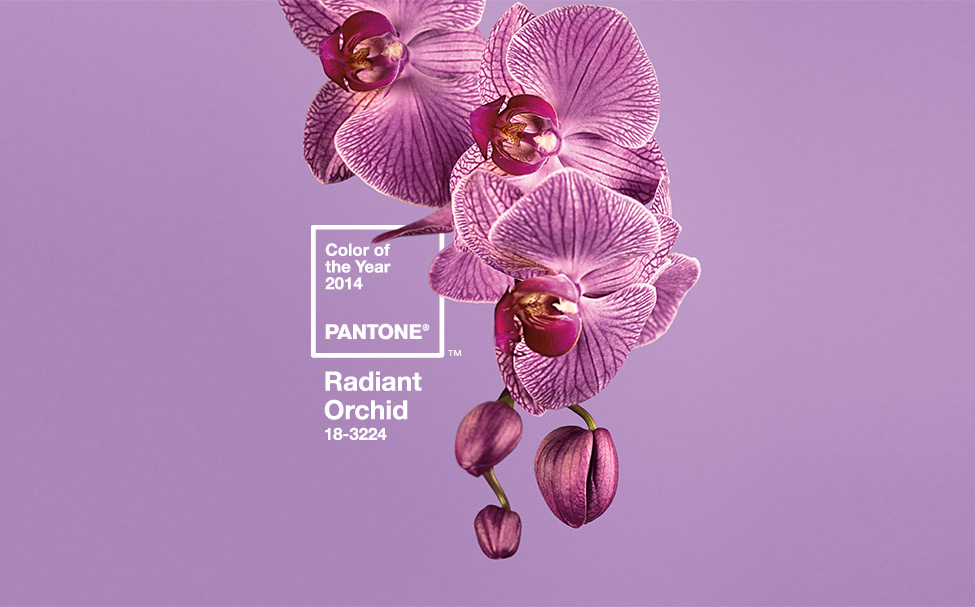
I thought that Radiant Orchid was this year’s Pantone Color of the Year. I saw it on television; I bought my friend Michele a gorgeous radiant orchid handbag for Christmas. Radiant Orchid was supposed to be the color of the year. Did I lose all my cool credentials — if I ever had them? Yet Mr. Internet provided proof that Radiant Orchid is ALSO the color of the year.
I was confused, so I went straight to the source — Pantone. And all is explained.
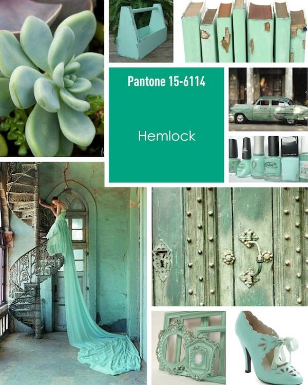
Looking ahead for tablescaping ideas for spring, we might want to consider Hemlock. Or maybe not. Will our guests enjoy a meal served with a Hemlock chaser?
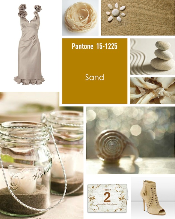
Or perhaps a little Sand on our tables?
Of course, we use these gorgeous colors in our tablescapes and home decor all the time. The colors of nature are our most beautiful colors. If I did a linky party, I might create a challenge to use one of the Pantone Colors of the Year — anyone want to pick this up?
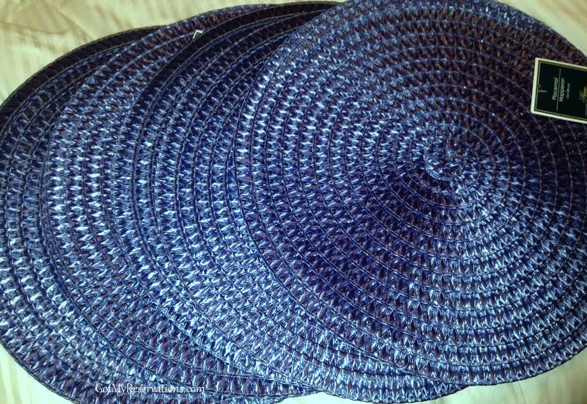
As for me, I grabbed six blue placemats at Dollar Tree today. I didn’t know at the time that Dazzling Blue was one of Pantone’s Colors of the Year 2014. I just thought they looked beautiful and were something I needed in my stash. I can see lots of blue and white scenarios with these gems!
Who knew this ole gal was so trendy? Or is blue ALWAYS on trend? I welcome your thoughts…
I’m linked up today with Seasonal Sundays at The Tablescaper. Be sure to visit Alma and the many creative bloggers who link up with her on Sundays!


I’m such a blue fan and have always been. It makes me happy to see that blue is back in. If for not other reason, it makes it easier to purchase more blue things!
Thanks for celebrating the New Year at Seasonal Sundays.
– The Tablescaper
Hmmmm…. all of the colors look good to me!
I’d like to invite you to a new link party, called Happy Tuesday. We’re sharing anything that makes us happy – we want to spread good vibes and positivity throughout blogland. You can find out more info at the link below. I hope you’ll come and join us!
http://holidays-at-the-harris-home.blogspot.com/p/happy-tuesdays.html
Thanks,
Jenny
I’m so out of sync with the in crowd, Jennie…I always thought that blue was called “cobalt” or “Barbara Bush Blue”. LOL I LOVE that color & I’m also extremely fond of the “hemlock” shade, only we used to call it “sea foam green”. That gown flowing over the staircase is exquisite!
I hope the radiant orchid remains popular, as I have a tablescape in my head with just those shades. All I need is some Spring weather to make it happen. Only 72 more days!! Yay!
Oh, mercy me! Such pretty colors! I can’t pick a favorite…and apparently neither could the folks at Pantone!!! 🙂 I just happen to have a set of plates with a butterfly just about the color of the one pictured in your Dazzling Blue collage. I’ve never used them, so this will be the perfect time! As for Talbot’s coastal classics, I’m all about that! I love classic dressing, and Talbot’s is one of my favorite stores.
Sand and hemlock. I’m cool with sand, but what the heck is hemlock? Isn’t that a sort of poison? Not sure I have anything in my stash in that color, although I’d love to have that vintage car pictured in the photo collage!
Glad you were able to find some really great placemats…at Dollar Tree, no less! Lucky gal! Enjoy those!!!
I love, love the blue. I just decorated my living room with it, where I used to have green, and I am loving it. Hmmm, the hemlock is pretty too. Will have to try to find a place to try that color.
Thanks.
Kristi
Actually, I think Pantone has so many colours of the year that they try to please everyone without making any decision. But I love their “hemlock” colour.
I love that Dazzling blue. Those placemats are pretty neat and I can’t believe you got them at Dollar Tree. Although, I love that hemlock shade too. So many lovely choices…
I’ve always loved blue, so it’s always on-trend in my opinion! I don’t know about the name, but I love that Hemlock color too!
I love the blue! I bought some antique china 2 weeks ago with blue lavender blooms. The blue looks like this 2014 color, I think. Come to find out, this was my grandmother’s pattern! You know I’ll be blogging about that soon. 🙂 Yes, we older girls can be trendy. Uh-huh! 🙂
Enjoyed the color trend post very much.
I am so out of the loop, I have no idea what colors are in or out 🙂 Plus I’m boring, I like colors like grey and black. The blue color is beautiful though!